CLIENT: Alton Main Street
DESIGN CHALLENGE: Utilizing a marketing grant awarded through Illinois Main Street, work with Alton Main Street’s design committee to rebrand the organization and capture the unique character — and real-life characters — that make the historic river town so special.
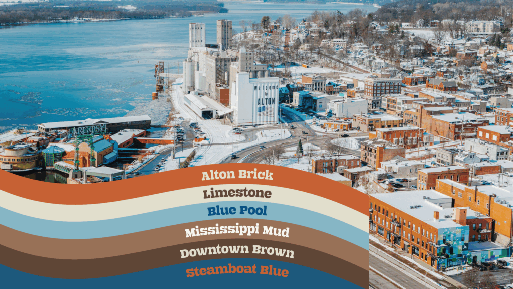
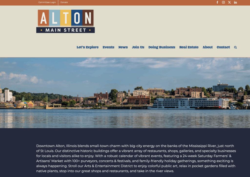
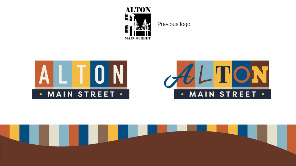
The new asset package features a straightforward logo for business applications and a second, fun logo to use on promotional materials. These logos are paired with a homespun color palette and a funky font aptly named: Riverbend. The vibrant brand colors are blended with a nod to the graceful curve of the Mississippi River that meets Alton’s downtown arts & entertainment district to make a distinctive and eye-catching footer element for the organization’s many promotional pieces.
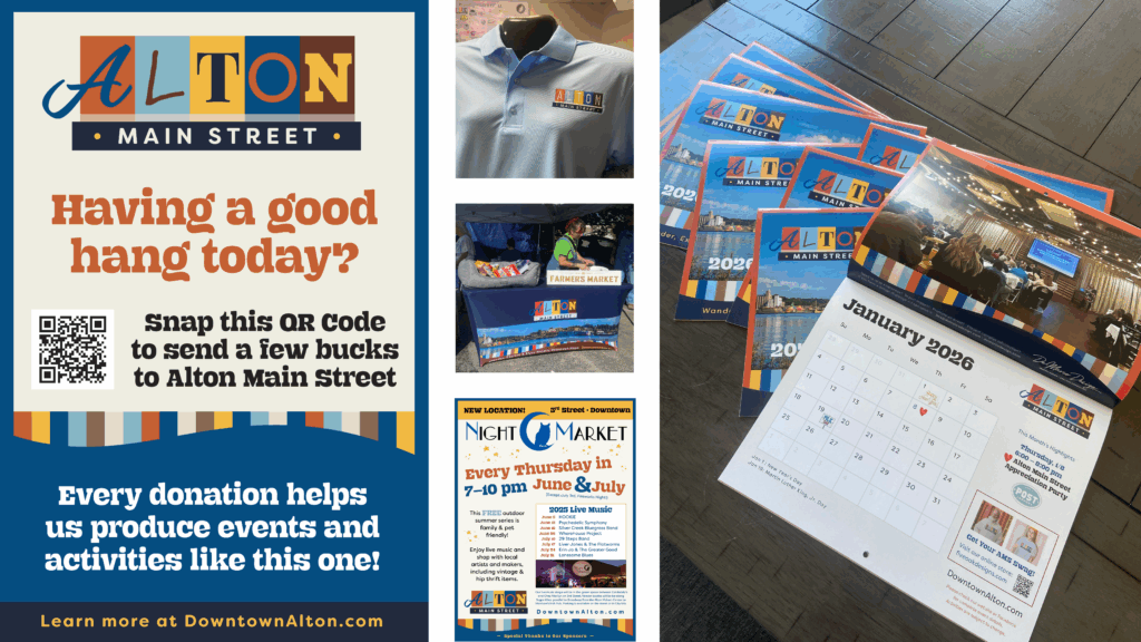
ELEMENTS: Printed collateral including rackcards, event posters, wall calendar, and online graphics for website, and social media graphics. An online swag store is available for residents to order customized merch including T-shirts, sweatshirts, hats, mugs, and more.
CREATIVE PARTNERS: Alton Main Street, Jacob Goble, and Five Oak Designs
CLICK to view the City Council Presentation